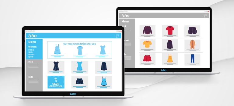
During the customer journey, users come into contact with many different pages of the online shop. In our last posts, we already looked at the ideal home page, the perfect product detail page, and high converting lead forms on a landing page. We continue our journey today, arriving at category pages.
An online shop’s category page gives users an overview of the product range and entices them to browse – and ideally to buy. Consequently, two factors are particularly important: relevance and convenience. After all, visitors should be able to quickly find an interesting product and not have to hunt for a needle in a haystack.
Sort the category page according to the user’s interests
The likelihood of users losing motivation or even leaving the website is very high if they have to spend too much time navigating the assortment. They are also often overwhelmed by the store’s diverse selection and have a hard time finding something suitable. Shop operators can do something about this by leveraging the user’s preferences to customize the category page. For instance, they can move their brand’s most interesting new products to the top of the page, while less relevant items can simply be moved to the bottom. There is no longer a need for the user to scroll for a long time to discover something suitable.
Personalized filters for a simplified product search on category pages
Not only are filters a great way to simplify the user’s search as much as possible, they also help the shop owner to learn more about the user’s interests. With the help of a filter function, the visitor can narrow down the product range to only display relevant items. For instance, these can be criteria such as fit, color or price range. If the user’s preferences are already known, these filters can also be preselected. In addition, filters offer the possibility of inserting more tailored product recommendations in the later stages of the customer journey. For example, only products in stock in the specified size or only products of the preferred color, on sale, etc. are subsequently shown.
Making use of product recommendations on category pages as well
In addition to filters, (personalized) product recommendations can also be used to gear the category page towards conversions. You can, for example, display the bestsellers or products on sale in the respective category. But also articles that are specifically targeted at the user can be presented as recommendations. Each user – whether known or unknown – can find the right product more quickly. Shopping becomes much less complicated.
Customize category pages for unknown users
If the user is not yet known, it will of course be difficult to use personalized filters or sorting. But it is certainly possible to optimize the page and simplify the search for products. One way to do this is to embed the various subcategories – such as down jackets, coats and transitional jackets in the “Jackets” category – in a clearly visible way as CTAs. Combined with matching images, the descriptions become even more tangible for the user. In addition, shops can position products that have recently been purchased frequently higher up. Of course, recommendations can also be included: Here, the bestsellers of the category can be used as the underlying logic, for example. The probability of meeting the user’s taste increases.
Promote promotions on category pages as well
Every customer is happy about discount promotions. In addition, users are often more willing to shop if they can save money in the process. So if there is a particular promotion such as a sale, savings packs or value sets in the respective category, it is worth mentioning. After all, nothing is more annoying than only finding out after shopping that you could have saved money. If you want to keep the reference to a sale on the category page rather subtle, the article can be marked with a flag in the product image or with a strike price.
More conversions with optimized category pages
If a shop offers a large range of products, it appeals to many potential customers. However, too much choice can overwhelm the user. That’s why it’s particularly important to help users find what they’re looking for. With the help of small adjustments, such as the interest-based positioning of products or personalized filters and product recommendations, shopping on the category page turns into a convenient experience. Instead of having to scroll through the lengthy product feed, users quickly find the right item and complete their purchase.
