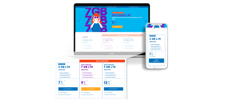
In order to always provide your customers with the best service, you have to continuously adjust and optimize your website. Online purchases depend strongly on the individual user experience of each customer. Therefore, it is important to provide your customers with a website that is both pleasant and, above all, simple to use.
Our customer Telefónica focuses on the continuous optimization of its users shopping experience on their website. Together with Telefónica/blau.de, we set up a test to answer the following question: Does the introduction of a direct entry to the shopping cart via “Tariff-Steps” (showing the different contract options) on the homepage simplify the customer journey and thus lead to a higher conversion rate in the contract portfolio?
How Telefónica increased the conversion rate by 28.8% with a direct link to the shopping cart
On www.blau.de, users can find an overview of the available mobile contracts, which clearly communicate the advantages of the different plans. The options are integrated directly on the homepage to allow the customer a quick and easy purchase. The individual plans are linked to the product detail pages which contain further information on the contract and from which the selected option can be added to the shopping cart.
The goal of the test was to determine whether or not a direct link from the individual rate offers on the homepage to the shopping cart would lead to a higher conversion rate.
The result: By linking directly to the shopping cart, Telefónica was able to significantly increase the conversion rate and achieve strong uplifts in the entire funnel.
You can read more about how the test was set up and what other exciting results were achieved in our case study with Telefónica.
