Generating leads is increasingly important in eCommerce as leads can be turned into loyal customers in the long term. So what is the perfect landing page with a lead form that converts as many users as possible?
As you can tell, we’re not talking about one specific landing page here as we were in the last two articles on the perfect homepage and the conversion-driving product detail page. This time, it’s more about the content that you can add to different landing pages with a common goal: to gain more leads.
Timing of displaying a lead form
One thing to consider when using lead forms is their timing. Worst case: You approach users too early, they’re caught off guard completely and bounce. So first off, strategize when and how you’ll display those forms. Do you really want to be “in your face” with an overlay just a few seconds after a user enters the website or do you want to give them some time to get acquainted with your content and offers and display the lead form just if they threaten to leave the page? You can also test all those possibilities and see what timing works best for your users.
Lead form placement
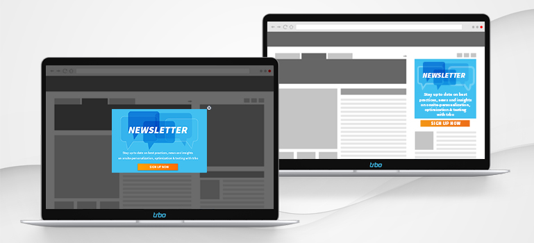
Lead forms can be displayed in all kinds of places on the website or webshop in a variety of different formats. As an inpage element or as an overlay, at the top or in the footer of the page, etc. You can also experiment with different options during the user journey – for example greeting the user with an overlay that then will turn into a flag on the side while browsing further or even vice versa. Which placement converts best is shop-specific and should be evaluated using A/B or multivariant testing.
As many fields as necessary, as few as possible
If an infinitely long lead form with many mandatory fields opens up, users are quickly intimidated. Accordingly, shop and website owners should evaluate the extent to which fields are really needed (e.g., the email address) and which fields can be removed from the form. You can also ask users to add further information about themselves at a later stage (if they wish to do so).
Another option that’s especially popular in eCommerce: social media single sign ons. This allows users to easily use their Facebook or Google login to sign in.
Highly visible and self-explanatory Call to Actions (CTAs)
Essential for lead forms: a clear Call to Action – nothing would be worse than the user abandoning the form because they don’t know where to click. CTAs should therefore be eye-catching in terms of color and show clear statements on what to do (e.g. “Sign up for our newsletter now”). Which color, wording and placement of a CTA works best can be evaluated with an A/B or multivariant test.
Optimized lead forms for more conversions
The perfect lead form is not distracting and leads the user directly to the goal: to sign up for the newsletter (or similar). With a few tricks and by testing, you can quickly determine which type of form works best.
