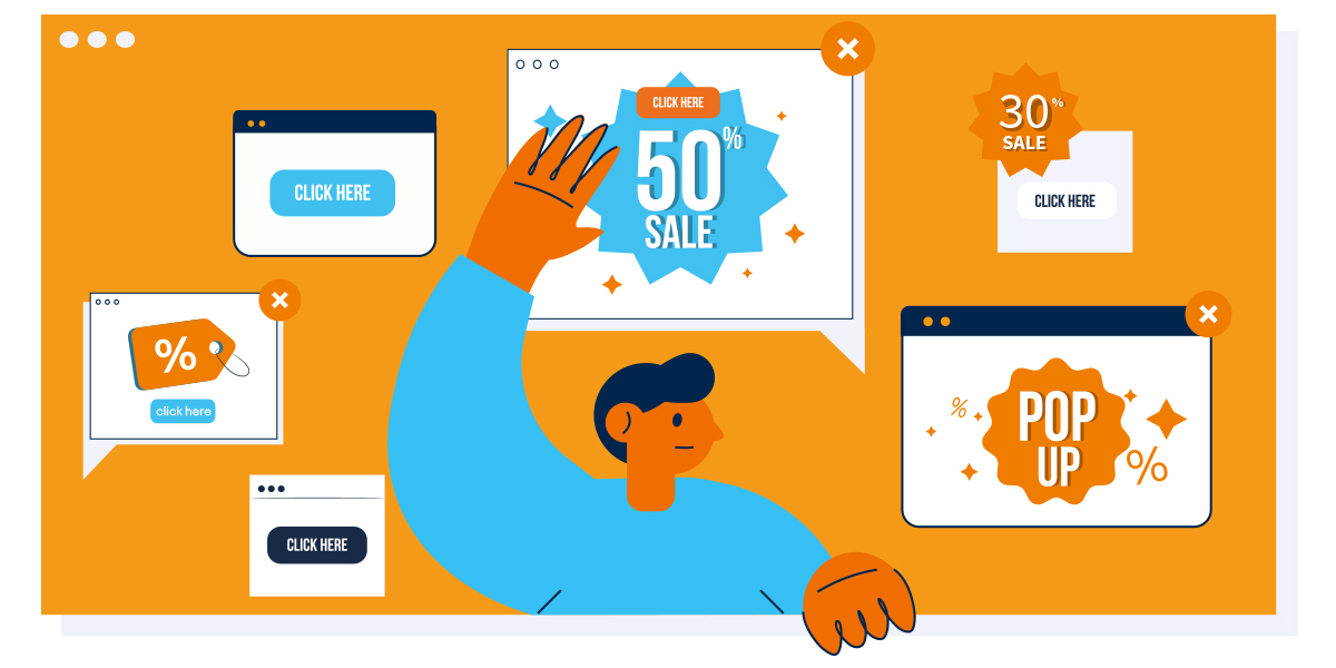
They used to have a rather polarizing reputation as one of the most annoying parts of the internet: so-called pop-ups (also: overlays). In fact, as of a few years ago, 73% of Americans said they don’t like them. With this kind of sentiment, it seemed like they would eventually be banned from our screens — but they’re not going anywhere. In e-commerce, pop-ups are celebrating their big comeback as marketers realize their potential to improve conversions. To put it simply: love them or hate them, pop-ups really work. Let’s explore how you can use these overlays to your advantage.
A new approach to customer acquisition: attract more customers with pop-ups
In brick-and-mortar retail, customers appreciate the personal human touch — over 70% report that retail workers enhance their shopping experience. Webshops can’t welcome you with a smile, but there is still a lot you can do to make visitors feel at home. With new customers, the first step is to gain their trust; one of the many times when an overlay comes in handy. Displaying your most important USPs, service promises and seals of approval in a pop-up message is the kind of assurance that can put your new visitors at ease.
Welcome overlays aren’t just a nice touch for new visitors; they’re a great personal touch for returning and existing customers too. A simple “welcome back” pop-up can give them the same kind of familiarity they might find in a favorite brick-and-mortar store. Use what you know about them to make it even more personal: Why not greet users with their last seen products, a sort of “Pick up right where you left off” shopping guide? For B2B shops that have personal contacts assigned to customers, an overlay with a familiar face including contact details is a great way to make visitors feel appreciated as valuable customers.
Promotions in the spotlight: get users excited about sales with pop-ups
Looking to draw attention to your summer sale? Pop-ups are the simplest, most direct way to get your visitors to notice. Users who don’t enter your shop through the homepage, for example, won’t be shown your main sale advertisement, so showing them an added overlay gives them useful information they might not immediately notice otherwise. It’s the kind of pop-up they’ll actually be glad to see, and can get them interested enough to stay in your webshop. You can even add a countdown to your overlays on product pages to remind potential buyers that your sale will be over soon and boost the probability that they’ll make an impulse purchase. Even better, create pop-ups with interest-based information for your returning customers to point out discounts on their preferred brands or products.
Wait, don’t go! Pop-ups as exit intent message
The most classic and common use of overlays is probably the exit intent. If a user is about to leave the page and moves their mouse towards the close button or the address bar of their browser, you can trigger an overlay with a call-to-action that persuades them to stay. This could be, for example, a reminder of your current sale, a look at your latest collection or a newsletter sign-up. If the user already has items in their shopping cart, a pop-up is a great way to remind them to purchase before leaving.
Cart abandonment is one of the biggest challenges e-commerce merchants have to tackle, and pop-ups are a proven strategy against it. Oui, an internationally successful fashion brand, tested this theory with an exit intent overlay and increased their conversion rate by an impressive 25%.
Would you like to learn more about this exit intent campaign? Download the Oui case study now!
Discount pop-ups and shopping cart reminders aren’t the only way to work wonders though. Any pop-up you show your visitors with helpful or beneficial information is a bonus: reminding them of your free shipping above a certain shopping cart value, for example, may convince some users to pull the trigger and make their purchase.
Looking for a way to grab leavers’ attention who don’t have anything in their shopping carts? No problem! Another reliable overlay to get visitors coming back is a newsletter registration message. Once they’ve signed up to receive newsletter emails, you can keep your webshop on their minds and convince them to come back to make a purchase later.
Testing ensures your pop-ups do their job — and aren’t annoying
Implementing pop-ups successfully is tricky, which is why it’s essential to test your campaigns to make sure they’re doing what they’re meant to do. After all, you don’t want to interrupt your site visitors’ product search or annoy them with the wrong message at a bad time in their shopping journey. Conducting A/B or multivariant tests is a surefire way to make sure your pop-ups are informative and helpful to your customers — or to make smart adjustments to improve their effectiveness when they aren’t.
Would you like to learn more about A/B and multivariant tests? Take a look at our whitepaper!
Love them or hate them: pop-ups really work
Remember that 73% statistic we mentioned at the beginning of this post? Well, that poll was taken almost a decade ago — things have changed. Pop-ups got a bad rap because they were overused and disruptive, but marketers have learned from those mistakes. If you show the right messages at the right time, pop-ups can give your conversion rates a boost, decrease shopping cart abandonment, increase engagement and much more. Don’t be afraid to put them into action! Your customers will thank you.
