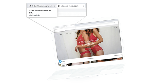
Occasionally, users behave in a way that seems strange at first glance: they place a product in their shopping cart, then leave the shop – but the browser tab remains opened. The first question you ask yourself is: Why? Some users might want to use their shopping cart as a watch list. Others might just have needed to run a quick errand. The problem is: they forget about the tab.
We have addressed this problem together with our customer erlich textil. Of course, we don’t want to withhold our successes from you.
Increasing the conversion rate by 6.8 percent with an animated inactive tab
erlich textil was faced with the challenge mentioned above: Some of their customers left the online shop despite having filled their shopping cart, keeping the tab open. The young fashion label was convinced that the customers had not yet completely lost interest in their purchase and wanted to draw them back into the buying process.
Therefore, we wanted to find out whether the visual emphasis of the tab would cause users to resume their purchasing process and, in the best case, complete the purchase.
In a test the standard text module of the tab, the name of the product and the main category, was replaced by a moving text. The goal was to draw the user’s attention back to the tab that was still open after he had left it.
The result: Both the conversion rate and the conversion value were significantly increased.
You can learn more about the results and the test setup in our new case study with erlich textil!
Click here to download
