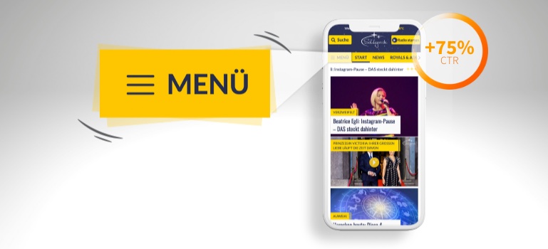
With up to 6.2 million visitors and 18 million page impressions per month, schlager.de is Germany’s biggest music portal. Since 2001, the portal informs its users about the latest news from the “Schlager” world on a daily basis, plus news on the royal and famous, puzzles and horoscopes. The numerous topics can be accessed via a burger menu with additional news categories in addition to the actual menu bar.
The challenge: users rarely clicked on this hamburger menu. Together with schlager.de, we set up a test: Would an animation help draw users’ attention to the menu and optimize click through rates?
75% higher click through rate with a vibrating hamburger menu
The test was initially implemented only on mobile devices: one-third of users were shown the regular hamburger menu, another third saw an animated hamburger menu that changed its color, and the vibrating hamburger menu was displayed to the final third of users.
Would you like to see the vibrating hamburger menu in action? Watch it on YouTube!
The results of the trbo test showed clearly that fancy ideas like vibrating animations on the website are effective in attracting attention. The click through rate increased significantly!
For exact figures and the setup of the test, read our case study with schlager.de.
