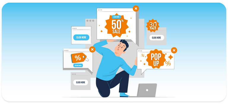
They used to have a rather controversial reputation – some people like them, others hate them: so-called pop-ups (also: overlays). Just under 70 percent of Internet users in Germany found them annoying a few years ago. It almost seemed as if overlays would be completely banned from our screens. In e-commerce, however, pop-ups are now celebrating their big comeback. Marketers are increasingly realizing their potential to improve conversions. In today’s blog post, we describe how you too can benefit from different overlays.
A different approach to customer acquisition – using pop-ups to attract more customers
In brick-and-mortar retail, customers appreciate the personal touch provided by employees. But there are other ways to address users personally in the web shop. With new customers, the first step is to gain their trust. This can be achieved with the help of an overlay. The most important USPs, service promises and seals of approval can be listed and are visible at first glance. Thus, the user’s initial skepticism can be taken away.
Not only new customers can be attracted with an overlay, but also returning and existing customers can be addressed individually. With a “welcome back” pop-up, they almost feel like they are in a brick-and-mortar store. Maybe they’ve been looking at different products lately? Why not greet users with their last seen products like, “Pick up right where you left off”. In B2B shops, customers often have a personal contact. If the familiar face including contact details greets them from the website, users are sure to feel more at ease right away.
Promotions in the spotlight – encourage purchases with pop-ups
If there are promotions such as a summer sale, overlays are a good way to draw attention to them. Users who, for example, do not enter via the homepage and may not even know about the current sale that is being advertised there, are informed about additional bargains. It also arouses their interest and encourages them to stay in the webshop. In addition, a countdown can also be included in the overlay to create the feeling that the product will be out of stock soon. The probability of an impulse purchase increases. For users who are already familiar, you can also fill the pop-up with interest-based information. Here, the sale in the favorite category or the novelties of the user’s favorite brand are pointed out.
Ready to back out – not with pop-ups
The most classic and common use of overlays is probably the exit intent. If a user is about to leave the page and moves his mouse towards the close button or the address bar of the browser, an overlay with different content appears. For example, the current sale, the latest collection or a newsletter registration. If the user already has items in the shopping cart, these can also be brought to the fore once again.
Our customer sonnenklar.TV also opted for an exit intent action in the form of an overlay. A voucher appeared for users who threatened to cancel the booking. To secure as much margin as possible here, the amount of the voucher was linked to the booking value. The result: The revenue per visitor increased by up to 18.7%!
Not only discounts can work wonders. A reference to free shipping above a certain shopping cart value may also persuade some users not to cancel the purchase after all.
However, if there are no products in the shopping cart, you do not have to sit and wait. Another, often and gladly used, kind of the overlay: The newsletter registration. This way, users are retained in the shop for the long term and may buy at a later date.
Testing is the be-all and end-all
Especially with a tricky topic like pop-ups, it’s important to test the campaigns. Marketers don’t want to drag users out of the product search or even annoy them. On the contrary, overlays should be informative and supportive. That’s why it’s essential to conduct A/B or multivariant tests here as well. This allows shops to determine whether the pop-up is well received by users or not.
A love-hate relationship with pop-ups – a versatile element with potential
Pop-ups have been disliked in the past, and not without good reason. They were often perceived as annoying and inappropriate because they were used penetratingly and far too often. However, this has changed significantly in recent years. Shops can now adapt the elements to their users. The user is therefore addressed at exactly the right time, in the right place and with the appropriate content. Instead of finding them annoying, more and more users are now reacting positively to the pop-up. Many stores are increasingly using them to successfully convert users and generate sales.
