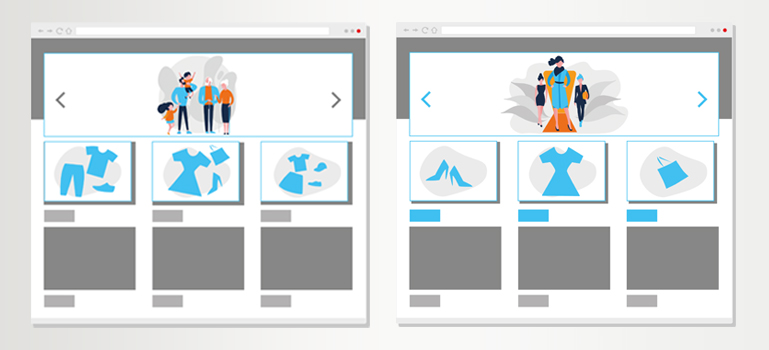
The homepage is the online shop’s store window: it gives users a first impression of the assortment, an overview of current promotions and offers initial inspiration. Within a very short timeframe, users will decide whether the shop meets their expectations or not. Those expectations are constantly rising and right now they include: being addressed individually with the relevant content. 74 percent of online customers are frustrated when websites display content that isn’t interesting to them!
A homepage that converts users into buyers is therefore as individual as possible and perfectly trimmed to lead to as many successful transactions as possible. But how does it work and what does a homepage that converts look like?
Dynamic adaptation of teaser areas on the homepage
Content becomes relevant when it is tailored to the user’s interests. Shops that recognize these in real time and react dynamically score points. Whether the fashion store exchanges the generic women’s, men’s and children’s teaser areas for specific teasers on content with women’s blouses, the sports store that adapts the teasers to different types of sports or the pet insurer that provides suitable teasers for cat or dog lovers: Everywhere there are opportunities for dynamic content exchange.
Personalized product recommendations right from the start
Returning visitors in particular often re-enter the shop on the homepage. Product recommendations make it particularly easy to get right back into the buying process: the latest offers from the preferred category, the most recently viewed products, the trips last searched for or the “forgotten” shopping cart from the user’s last session: With a click, users get right back on the path to conversion. With recently viewed products, our customer beck-shop.de was able to increase the conversion rate by a whole 19%!
Address & convert unknown users in a personalized way
For an initial personalization, the user’s location is sufficient: regional promotions and products are then suggested on the homepage or, in the travel industry, the nearest airport is filled in directly in the search bar. The weather also can play a role: teasers and banners are adapted to the regional weather. This can not only make the search easier for the customer, but also trigger an impulse purchase.
From the homepage directly into the shopping cart
Users don’t always have to be encouraged to click through the assortment for inspiration. They can also be led directly to the purchase on the homepage – without detours via product detail pages. Our customer Telefónica shows that this works. On www.blau.de, tariffs are clearly presented and the link to the product page is replaced by an “Add to cart” link. The result: a conversion rate increase of 25.8%.
A personalized homepage as a conversion t(u)rbo
If the homepage’s content is personalized and optimized, the relevance for the user increases and the (re-)entry into the purchase process is made with one click. With customized content that makes shopping convenient, not only do conversion rates increase – customers keep coming back in anticipation of new content that excites them.
