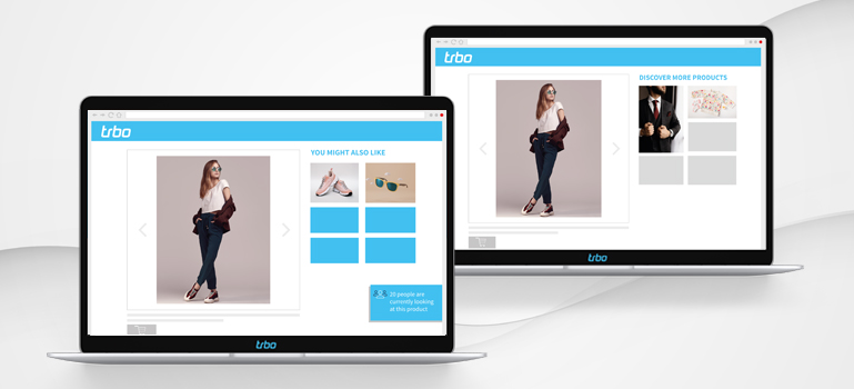
When it comes to making a purchase, the product detail page is the star. This is where the decision whether the product will be added to the shopping cart or doesn’t meet the user’s expectations is usually made. Therefore, it is immensely important to optimize and personalize the product detail page as much as possible.
A product detail page that converts users to buyers is therefore as individual as possible and perfectly tailored to the individual customer. But how does this work?
All information at a glance
On the product detail page, users want to find one thing above all else: More information about the product. What does it look like, what other colors are available, what sizes and much more. But what about the fit? A clue is provided by sizing information (e.g. runs small – it’s better to order a larger size) or size charts, which allow the user to choose the right fit.
Perfect product descriptions
There is a reason why a lot of work is invested in product descriptions. After all, they serve two purposes at once: The user can get a comprehensive picture, while optimized texts lead to more visibility in search engines. But which product description really converts better? Flowery and detailed or as short as possible? This varies from shop to shop and should be tested!
Offer images with effects as an additional decision-making tool
In addition to perfect product descriptions, images are also essential. So how about offering images with effects to users as well? This works as a simple view of how the product (e.g. a dress) looks when worn. Or go one step further, which is particularly useful for products that require explanation: The user can watch a suitable explanatory video accompanying the product.
Ratings & Group Motivation to support decisions to buy
When buying a product, many users rely on the opinions of other users. Reviews of the product therefore also belong on a product detail page – where exactly they should be integrated can be analyzed using A/B and multivariant tests. Another way to harness the power of the community: Group Motivation elements. They indicate how many users are currently viewing the product or have already bought it. What’s bought most must be good – the pressure will increase purchases. Our customer Oui increased the conversion rate by 9% this way!
Alternatives or add-ons with (personalized) product recommendations
On product detail pages they are often integrated: Recommendations. Ideally, they are particularly relevant for the user – which you can achieve using personalization. The surfing and buying behavior is taken into consideration and the ideal recommendation is generated for each user. With personalized recommendations, our customer LaShoe was able to increase the conversion rate by 29.8%! This way, additional, suitable products may find their way into the shopping cart – or the user may find an alternative, should the product just viewed not appeal to him.
Enriched and personalized product detail pages for more conversions
If users find all the important information and perhaps even additional products on the product detail pages, coupled with a little psychological pressure, the likelihood of completing a purchase increases. Users feel well advised and are happy to buy (again).
